
Geotab - Data Dictionary
Full redesign of an internal tool for data stewards and engineers
Lead Designer | Information Architecture | UI Design | UX Design
August - December 2021
What is the Data Dictionary?
The Data Dictionary (previously called ‘Data Routing Tool’) is an internal tool built for data owners and data engineers to manage schema (how data is organized) across different sources.
Background & Challenge
Data owners and data engineers currently manage schema using a spreadsheet. However, spreadsheets end up getting duplicated, accidentally updated, and ended up being unreliable as a single source of truth.
An opportunity existed for a tool where data owners are able to add schema, perform change management, and configure permissions. The data engineers are able to take the schema provided, and manage ingestion of this data into a warehouse.
I was added to the team to conduct a visual redesign of the project, but conducted a quick heuristic evaluation, did additional discovery work and redesigned multiple user flows in order to align with personas and workflows.
Solution
The solution was to redesign the whole Data Dictionary platform form the ground up, in multiple stages throughout a few months.
View Figma Prototype (might take up to a minute to load)
Full Design Process
Phase 1 — Visual Design & Heuristic Evaluation
Design
I was added to the team to conduct a visual redesign of the project, and used this time to build relationships with this team, learn more around the challenges surrounding this product, and get a quick win.
To get ramped up to the project, I started with designing out low-fidelity screens of all the pages, starting with the navigation.
I took what existed from the “original designs”, and rethought through the various pages and how they should link together with the Product Manager.
Navigation V1
Navigation V2

Navigation V3
I used Geotab’s design system in order to update all components.
I also conducted a heuristic evaluation in order to ensure the product met more usability benchmarks, including:
Visibility of system status - Different states on components (fixed with the design system)
Visibility of system status - snack bars were added when actions were completed
Help and documentation - Users knew what certain terms meant (added tooltips)
Phase 2 — Research
After updating the navigation and designs, I wanted to validate some of the workflows with users. I learned that the existing flows in the routing tool was based off of assumptions on how users worked, but there wasn’t a consistent definition between users what the process for different team members should be.
I conducted research by speaking to different employees to understand:
How data owners approached schema management within the spreadsheet
How data engineers used the spreadsheet to sync data into the warehouse
Assumed workflow vs ideal process
After speaking with data owners, I learned that found the spreadsheet process to be straightforward, but currently relied on other team members to guide them on how to fill out the raw schema, clearance levels and dataset mapping. Each data owner had a different process for gathering data, and mapping information.
I learned that data engineers worked with the data owners to bring in their data into a warehouse. They would do this by gathering the raw schema, working with the team to do mapping, and set up some configuration levels themselves. Afterwards, they would create scripts to provision tables and datasets, and then sync the actual data. While engineers worked with data owners to do clearance level and dataset mapping, they would like the owners to first do a first pass at this.
Phase 3 — User Flow Updates and Testing
I started with some quick mockups of various ways users can add clearance levels, and map tables to datasets.
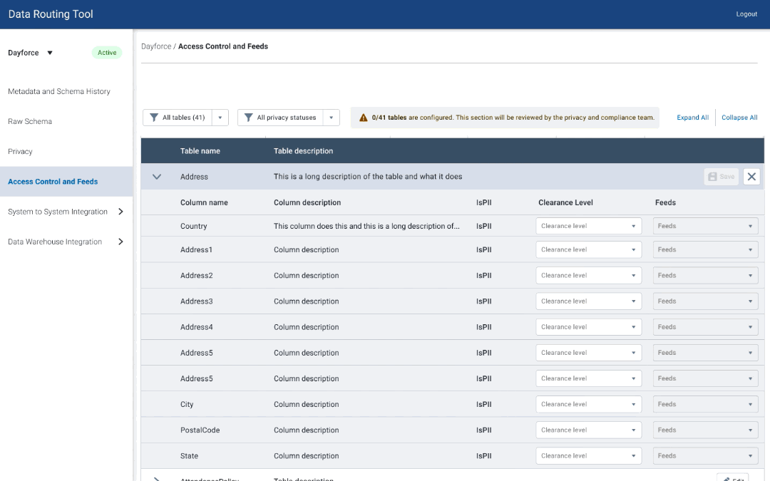
Access Control - V1
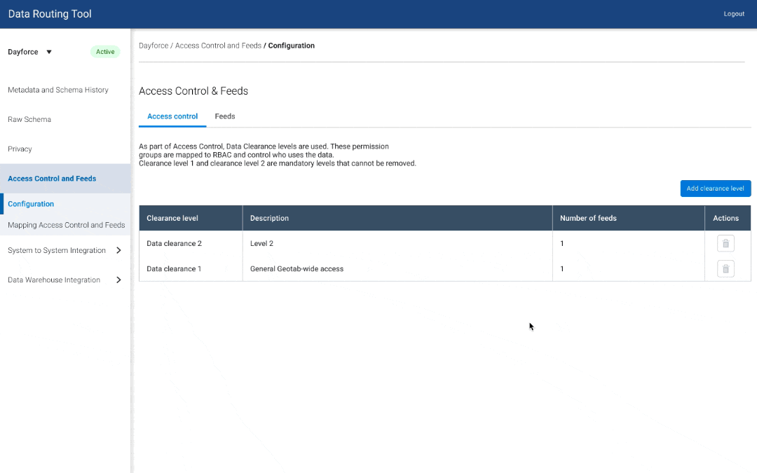
Access Control - V2

Access Control - V3
I expanded on one idea and used a wizard flow to fully design out 2 different views of clearance level and dataset mapping.
I tested the versions with 5 data owners to see if there were usability errors with either approach, and if users had a mental model of how they associated clearance levels, datasets, and tables.
User Testing Findings
Adding feeds and editing feeds were separate steps - ⅗ users got confused because it looked like the same step for them
There were more user errors for V1 - ⅖ users made mistakes with the mapping - clicked on the wrong datasets
⅗ users associated feeds with tables under it (mental model)
Based on the user testing, I went with V2 since more users' had this information hierarchy as their mental model, and more users made mistakes with V1.
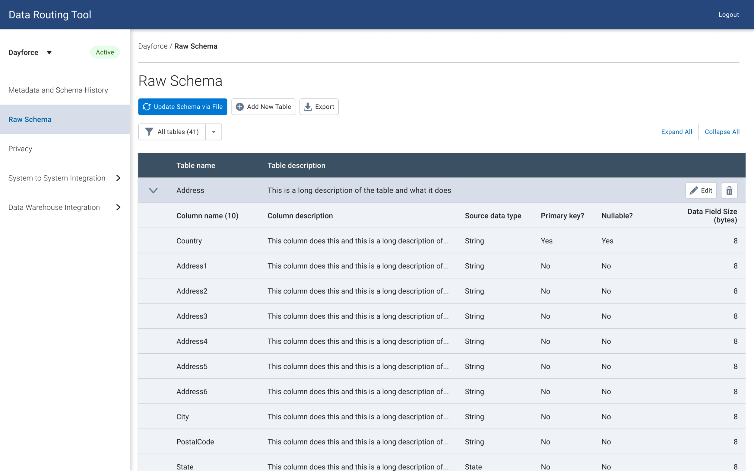
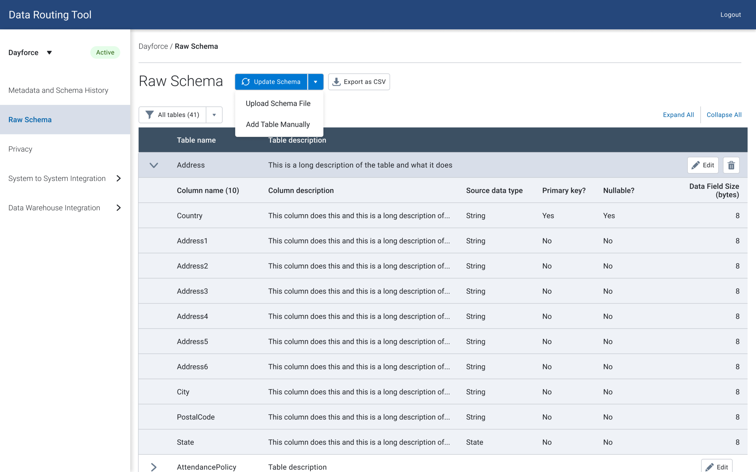
Phase 4 — Schema Management & Testing
Since data owners are used to using spreadsheets for schema management, they can freely add or remove tables, columns and edit fields.
However, within the data dictionary, users could only edit existing tables through the UI. They would upload a file every time they needed to update the schema with additional tables, which would be tedious when they needed to just add one table or column. Furthermore, there was no way to deprecate tables, or mark them as inactive.
After doing some design research, I came up with a solution to design out a few ways for the user to manage schema:
Expand the scope of bulk updating via a file
Adding tables
Update schema in-context (table view)
I then played around with some versions of where to place the action buttons.

Button Variation V1
Button Variation V2
Button Variation V3
While editing, deleting and adding functionality are usually done in parallel, the product manager hypothesized that users may not know where to add/delete columns, and wanted to test out a version where the add / delete buttons are outside of the edit view. I tested out two versions to determine if users had trouble finding add/delete columns.
Add / remove tables within editing
Add / remove tables outside of editing
⅘ of the users were able to find the buttons by navigating to the edit button, and all of them mentioned that they would perform all the different actions together.
Unfortunately, I did not have time to work with developers on implementation before moving to another team, however I prototyped out a recommended solution, with some additional context into what could be removed.
View Figma Prototype (might take up to a minute to load)
Next Steps & Retrospective
The Data Dictionary is starting to be used by internal employees and we are getting great feedback. 50% of systems were added after one month, and it on average takes a user <5 minutes to create a system and upload schema. However, if I was still on the team, I would have liked to measure task success / time it takes to complete other actions.
Looking back on the design, I would have liked to take the time to focus on the design and interactions of schema management to mimic spreadsheets - such as the ability to copy and paste across rows and columns to input data quicker.